Billing and Plan Management for Eventbrite’s Pro subscription and pay-as-you-go plans
Skills I used:
Crafting scalable content and design components
Reducing friction
Edge cases
Writing error messages
Summary
Finance and billing design is anything but easy. So many edge cases can crop up quickly as engineers start building. In this project, I learned that crafting scalable content is key when it comes to billing UX—and that it’s worth booking one-hour jam sessions with your product designer to craft design components that are elegant and intuitive.
Eventbrite’s new pricing plans needed a place where creators could manage their plan. Meet the “Plan Management” tab in Organization Settings.
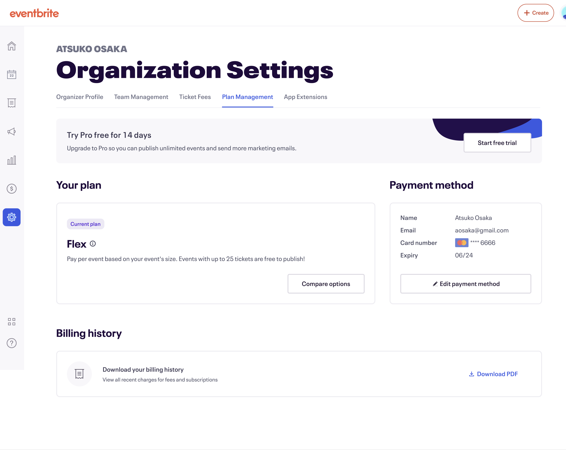
We had nine new pricing plans that a creator could be on, which meant tI would need to be thinking of an infinite amount of user journeys and use cases. Think upgrades, downgrades, trial activation, trial cancellation, upgrading while on trial, adding/removing/editing payment method…the list goes on.
While my product designer and I crafted what we thought was our happy path with most of the edge cases considered, engineers started pinging us left and right about errors we didn’t account for, or cases we hadn’t even considered.
Money is a touchy subject for many users (including myself!) so I knew I’d have to be as clear, straightforward, and transparent as possible in my content—but also in our designs, too.
We had a couple of problems to solve, including:
How do we create content and designs that scale for all use cases and errors?
How do we show “the math” upfront for upgrades/downgrades and in pro-rated situations to maintain user trust?
How can we remove friction, where possible?
To keep plan card content scalable, I took inspiration from Classpass.


To keep pricing tooltips scalable, I looked to Depop’s itemization.
Payment method seemed more straightforward, but I had to consider all the different entry points where someone could add or edit their card.

Desktop and mobile versions of the Plan Management tab in Organization Settings.

Error state messages if both plan and payment method couldn’t load, or only one. Content was slightly altered to fit the specific section that wasn’t loading.

Plan card states depending on payment status, both desktop and mobile versions. Sentence structure followed a lot of what I appreciated in Classpass’ content.


Trial card states depending on the user’s trial journey. Also included all states of the payment method card in Plan Management.

Saved card state at checkout.

Add/Edit payment method when at checkout. You couldn’t remove a card here in this experience, only via Plan Management. (Which I also had to design an error message for.)


Entry points in other parts of the product (where subscription info used to live) that would redirect to the Plan Management tab within Organization Settings.
Our current cancellation flow had a bunch of friction—and also, bad user practices! I had to fix it.
I improved the cancellation and downgrade experiences by creating one-click cancellation UX, clear messaging, and moving survey questions as an optional step after. This removed Toneden’s original manipulative pattern that caused friction, and made our experience compliant with Legal. I also worked with Legal to align on terminology (ie. Organizer Fees and Ticketing Fees) and crafted accurate terms for subscription, upgrade, downgrade, trial, and cancellation experience.
Upgrades were part of our first billing launch, but switching to a different plan and ‘downgrades’ were fast follows.
We created an in-actionable CTA and I wrote content that said “Current plan” to denote where the user was spatially within the pricing tiers. So as they toggled between plans, they could always remember which plan they were on. I would’ve loved to make that more clearer (ie. “Your plan”) somewhere more noticeable in the design, but engineering didn’t have a lot of time and we wanted to ship the quickest, most low-lift solution possible for now.
I also strongly advocated to my product manager, engineers, and product designer to implement a new image for the downgrade/switch confirmation screen. Yes, it would be more effort to implement—which they weren’t looking for—but if we kept the image the same as our current upgrade image, then the mood and copy would feel mismatched. Wouldn’t it look like we were ‘celebrating’ their upgrade/switch? (Image below for reference)
I advised for a more neutral image, and also wrote copy that was also neutral and avoided negative language that would make the user feel bad for choosing to downgrade (ex. “Sorry to see you go!”) That’s not the company we should be!

1. User accesses our plan modal from Plan Management and current plan (Pro Unlimited).

2. User toggles to explore a lower tier (Pro 250) and selects “Subscribe now.”

3. User receives a checkout screen with the new pro-rated plan and conditions, with tooltip.

5. If user selected “Got it!” or closes, they’re taken back to Plan Management with an updated plan card outlining their confirmation to switch to a different plan with the date and amount.

4. A new “downgrade” screen, using neutral language that outlines the new benefits.

Reference: The current upgrade plan screen. This image is celebratory, and would look odd with a downgrade or switch plan use case. (Image above)
Introducing annual plans soon after was a breeze, because I’d already crafted scalable content. It also contributed to a lot of revenue.
Three new annual plans (for a total of 12 plans) slotted in relatively easily: my designer and I had to adjust our in-product pricing modal to include a badge about our annual plan offerings (which I took inspiration from Squarespace), but other than that, the rest was relatively easy to switch tooltip and trial card language to yearly language.

I chose “yearly” over “annual” because it’s easier to understand and less formal than “annual.” (Despite most competitive analysis.)
My Product Marketing Manager also wanted to lead with savings and how much someone would save with an annual plan. This was a bit of a challenge for me, and I argued that there were already so many numbers of the page which could increase cognitive load (also, having to think in $ amounts vs. % amounts on one page could be challenging). I used the UK’s readability guidelines and how to present numbers as principles and further rationale and that we should adhere to best practices. But unfortunately we needed to ship quickly and the PMM wasn’t aligned, so I decided to keep it was “Save %” since I didn’t think it was a content decision hill I wanted to die on.
Since launching pricing and packaging last year in 2023, I contributed to $30M+ in revenue as of Aug 2024 from all plans. For annual plans specifically, it resulted in $433K MRR in Q1 2024, and an estimated additional $1.3M ARR for 2024.
Thanks to a scalable content and design pattern, we were able to reduce engineering complexity and effort, faster shipping times, and a whole lotta cash. 💰
What I could’ve done better
The long CTAs in the in-product plan cards. It is the bane of my existence, and I feel so bad that I broke my company’s own Content Standards and Style Guide. While I made the plan cards, tooltips, and other elements of the experience scalalbe, I would love time to go back and apply that same scalability to the CTA content. (Or, maybe these shouldn’t even be CTAs?)
A/B/C Test “Save 20% ” vs. “Save $64” vs. “[Plan Amount] per year.” I still have a burning hypothesis—and a want for symmetry in the content pattern. If given the bandwidth and engineering resourcing, I would want to test two different variants against the control and see if they lead to more annual plans or not, because we showed the same amount of billing measurements.